Tuesday, December 13, 2011
Monday, September 19, 2011
Saturday, April 2, 2011
Choices for markmaking with ink
This was my composition. This is a different view though, the correct view is further below.
Different view of the composition I picked. Some nice cast shadows
This was my smoky paper(grey paper) tree composition, I thought about doin the same composition again for this assignment but, again the sun was very inconsistent.
This is the composition I went along with finally. I liked the fore ground elements and the leaves at the bottom right, the light source was nicely directional, good cast shadows, managable composition, what not to like? well maybe the ink and stick technique.
Wednesday, March 2, 2011
Stuff I found
Thinking of trying to make that water effect come to life with simple material. That should be greatly timeconsuming.
Interesting relationship between lights and darks
in the tree.
BLAH!
I think outside assignments suck because the light information is always changing! I wish I cud just pause the live world. I might have to start working from pictures/photos. :(
Thursday, February 3, 2011
I think this was very creative. I feel like in the beginning there was too much white but as it went on everytime the door is closed we feel a sense of appreciation for the light therefore it was some good contrast of both extremes
http://www.youtube.com/watch?v=2TncKWs6DNc
Oh my goodness I wish you knew the story line to this video game, SIMPLY BREATHTAKING. its the whole reason I'm here now. Umm the contrast is there between lights and darks, in the death scene the girl is lit up as if to show she's at piece and the hero is really dark, maybe to show the weight of his emotional state.
http://www.youtube.com/watch?v=m-u07UEDT5I
And ofcorse the awe so influencing superhero, batman, many scenes of his are off the hook. In this one the contrast between light and dark, I think, places emphasis on the characters and at the same time creates visual interest. Also at the end after batman seriously kicks ass, he leaves the crooks on the surface where they are lit up. That looks like it can be done with some sienna conte. just a btw.
http://www.youtube.com/watch?v=gdr1DGaSZGk&feature=related
http://www.youtube.com/watch?v=2TncKWs6DNc
Oh my goodness I wish you knew the story line to this video game, SIMPLY BREATHTAKING. its the whole reason I'm here now. Umm the contrast is there between lights and darks, in the death scene the girl is lit up as if to show she's at piece and the hero is really dark, maybe to show the weight of his emotional state.
http://www.youtube.com/watch?v=m-u07UEDT5I
And ofcorse the awe so influencing superhero, batman, many scenes of his are off the hook. In this one the contrast between light and dark, I think, places emphasis on the characters and at the same time creates visual interest. Also at the end after batman seriously kicks ass, he leaves the crooks on the surface where they are lit up. That looks like it can be done with some sienna conte. just a btw.
http://www.youtube.com/watch?v=gdr1DGaSZGk&feature=related
Monday, January 31, 2011
Sunday, January 23, 2011
New Year! first week
Coolness. I like progress, its good. So now we're doing this shading thing, light and dark contrasts, very cool, but time consuming!! I prefer the texture that appears when one rubs the charcoal off, Its more visually interesting in comparison to gesso. Though gesso is more likely less time demanding, so yea. Lets see what the semester holds shall we?
Tuesday, December 7, 2010
Progress(Evaluation)
I feel like I have progressed well through the semester. Line has definitely sinked into my artistic sense and now I pay good attention to it when I work on my own pieces. For me especially, working on comics and all, I think playing around with line is very important so as to guide the reader through the events and not to confuse them. I don't feel like I have lost anything in terms of my technique. I think I have built up on it and I'm looking forward to developing some more.
Saturday, November 20, 2010
Preferred material
I would have to go with charcoal. I like how it glides though the page especially when dealing with a big composition. Also it has a good effect for line variation as all you have to do is apply pressure and it gives you a solid thick line. Graphite needs too much elbow grease. It can also give you a good crisp line and it trails of very naturally. yes.
Monday, November 15, 2010
ASSIGNMENT FOR SELF PORTRAIT
Hope I didn't make myself look like a cartoon by working backwords, but back home some people used to say that I look like a cartoon, hehe. But yes, I did chose to work backwards, finished to unfinished. Felt slightly bad messing it up, but hey, I had just won 20 bucks when nuggets beat the lakers, so it was cool.
Saturday, November 13, 2010
graphiti Art
This is just some stuff that inspires me when I wanna put line variation on small parts in huge compositions. Because it actually makes a difference when you step back.
COMIC BOOK CRAZE
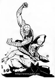
Comic books and comic book images. They have so much stuff in them. Line work and value, but it bugs me nowadays because I see such little variation.
Sunday, October 31, 2010
Landscape
Stiill looking for an ideal composition. I found one, but it's too cold to go out there and sketch real quick... actualy maybe not. The biggest problem will probably be getting my line work real confident and right at the same time
Sunday, October 24, 2010
Paper assignment
Difficulty! Plain and simply difficult. Here I am trying to make something unique, tearing up my very expensive bond paper.. I felt like screaming at something. Anyway, hopefully my practice on the sketchpad will help and maybe the use of old techniques from this class will also come in handy.
On the sketchbook, i figured using lines for the curves would be a better idea for the beginning sketch. Again we'll see what happens.
Thursday, October 21, 2010
Blind Contour Assignment
The assignment was very troublesome. I could never manage to get the line back to where it started. I was very confused and woried that I wasn't doing the right thing. The charcoal squeaked a lot. Luckily I was the only one who had to go through the torment. Trying to use up a good amount of the space was really tough and I wasn't sure if we had to put up a background. Yeah thats it
Friday, October 1, 2010
Thursday, September 30, 2010
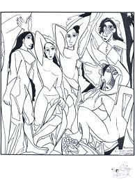
Monsieur(P) Picasso
My good hommie... hehehe. Anyway I seem to have some attraction to his work so I'm gonna do some studuies in my sketch pad. About his human figure analysis and how he played around with that to bring out the crazy moods that I have fallen for thus far. Photos comin up!!
Self Evaluation
Well, umm when we began the class I was kinda light with my pencil marks, probably because I worked more with pens over the pencil work. Though as we progressed I started strengthening some lines accordingly. Then I started getting bummed with all the crisp line work I had going on. I felt they were too crisp to be presented from a far.
Now from my previous assignment, advise was given regarding my pressure on the pencil work. Looks like I am on the other extreme! Need to strike a center pole.
Subscribe to:
Posts (Atom)